Clic - Web App Showroom
1. Context & Role
Client & Product: Clic — Danish high-end HiFi furniture that conceals audio systems in aesthetic designs
My Role: UX researcher & designer collaborating with a multidisciplinary student team
2. Problem
Clic’s sales process relied heavily on in-store dealers and printed catalogs. Customers faced:
Confusing journey: fragmented touchpoints, heavy reliance on dealer knowledge
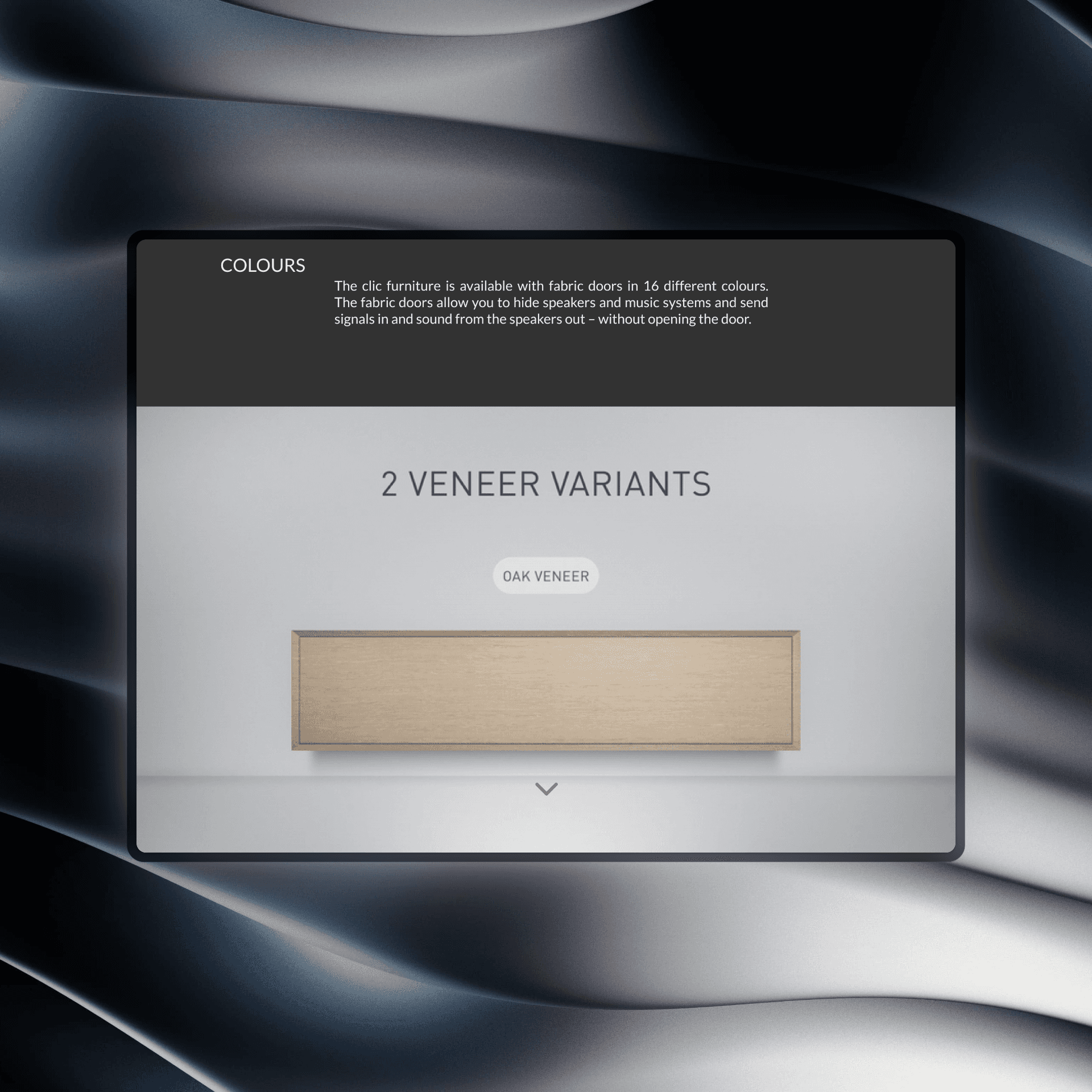
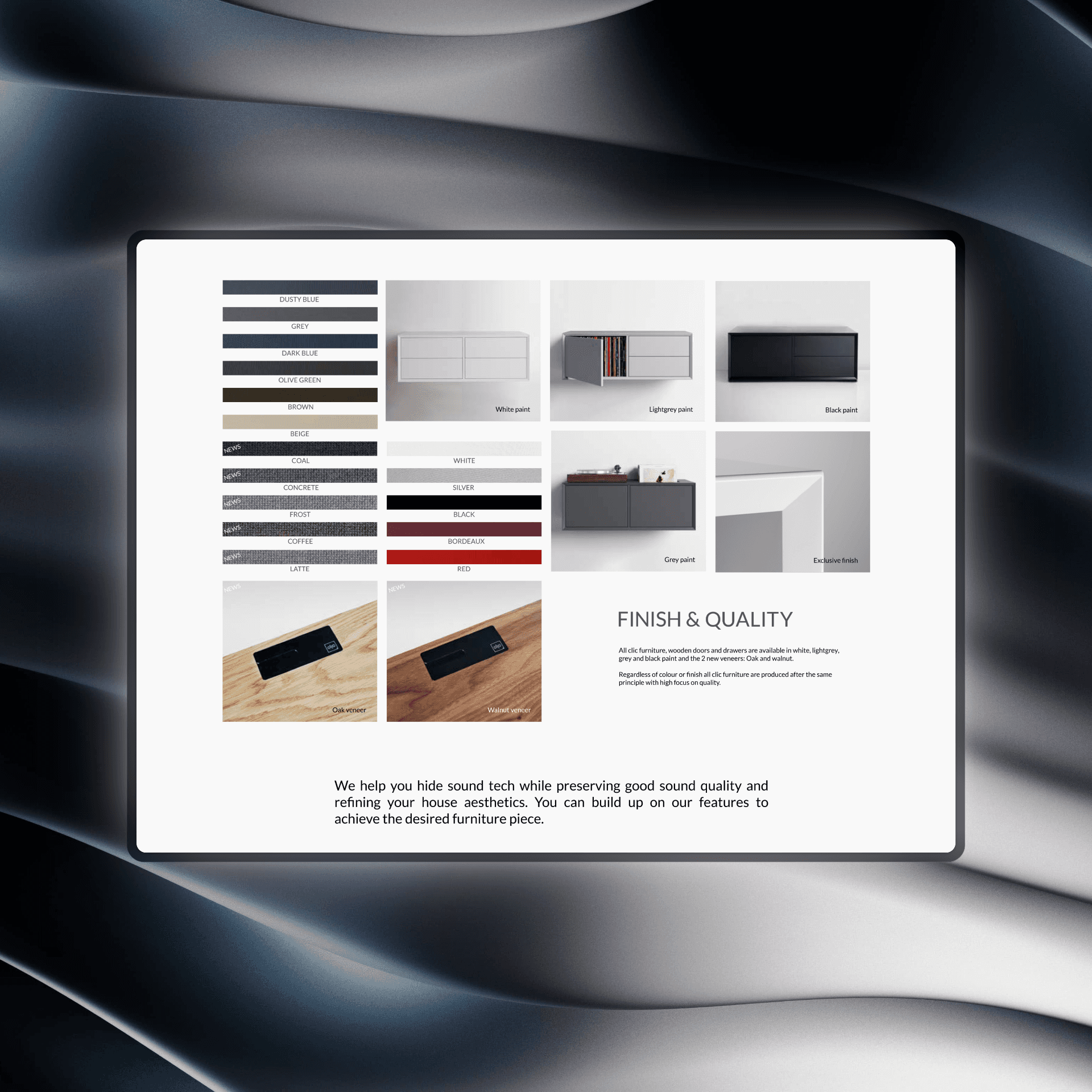
Limited visuals: static brochures failed to convey color, dimensions, or hidden tech
Customization friction: no digital way to preview personalized configurations
Goal: Optimize the buying process by converting static product information into an immersive digital walkthrough coupled with a 2D configurator, usable both in-store and online.
3. Research
3.1 Business Analysis
SWOT highlighted strengths (Scandinavian craftsmanship, dealer network) and weaknesses (complex selection, narrow awareness)
Competitor Scan (Montana, Lemus, Clic) revealed best practices: 360° previews, in-page reviews, built-in audio
3.2 User Analysis
Primary Research at HiFi Klubben Aarhus: observed 40+ buyers, dealer workflows, and in-store tech (desktop touchscreen)
Persona:
Age: 40–60, upper-middle class couples
Jobs: hide cables, preserve sound quality, express status through aesthetics
Pains: cable clutter, unclear specs, overwhelming customization
Gains: seamless visuals, easy configuration, premium assurance
3.3 Domain & Inspiration Mapping
Interactive Patterns: 3D rotations, detailed breakdowns, step-by-step walkthroughs (Formani, Insight Tech, Fitbit)
Emerging Tech: web AR for contextual placement; 360° digital catalogs for immersion
4. Ideation & Concepting
Key Insight: Users need both guided education (“What is Clic?”) and hands-on customization (Dimensions → Colors → Functions)
Solution Sketch:
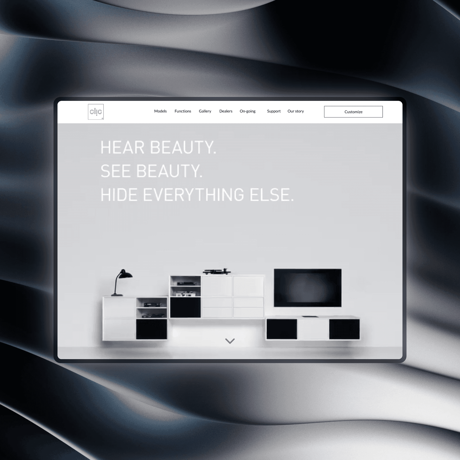
Hero Video: “Hear Beauty, See Beauty, Hide Everything Else” + “Get Started” CTA
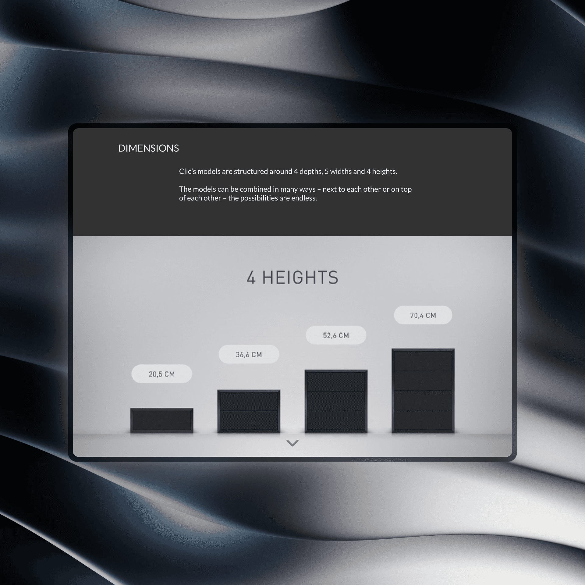
Intro Slider: Short brand pitch + model specs (depths/widths/heights)
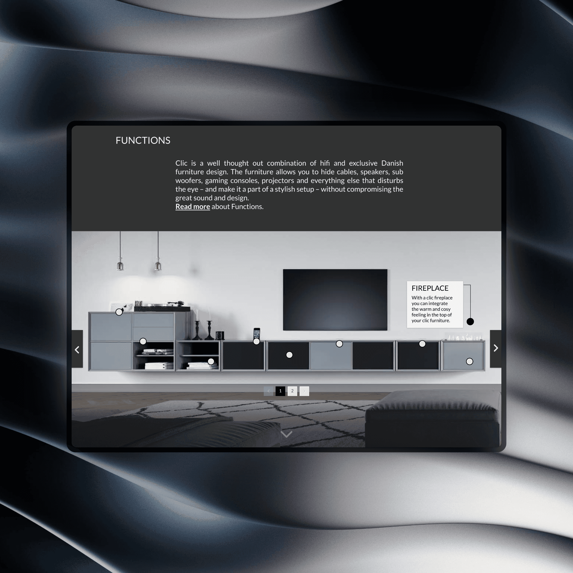
Feature Breakdown: Interactive steps for Dimensions, Colors, Functions
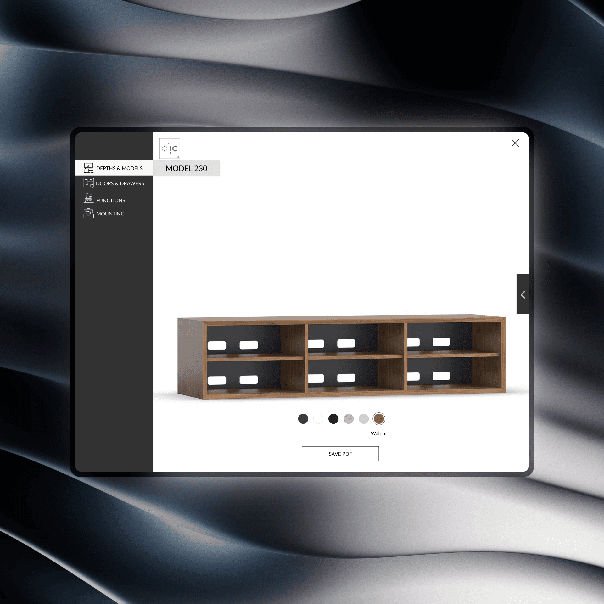
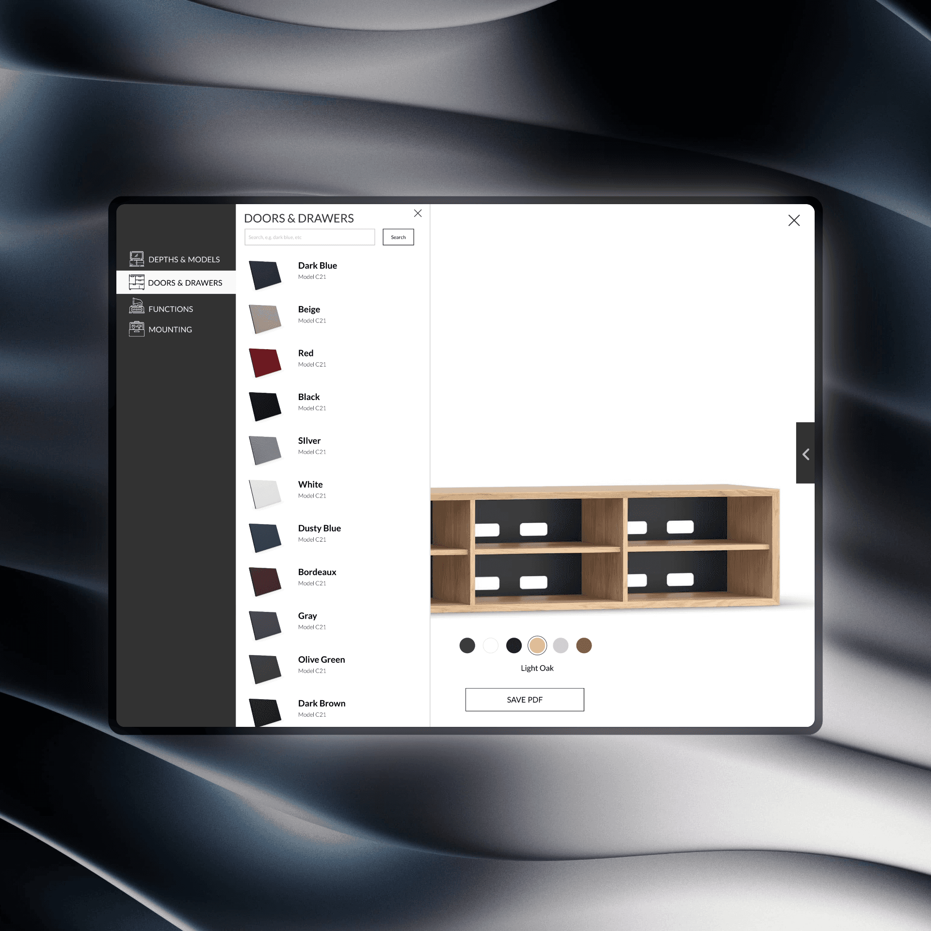
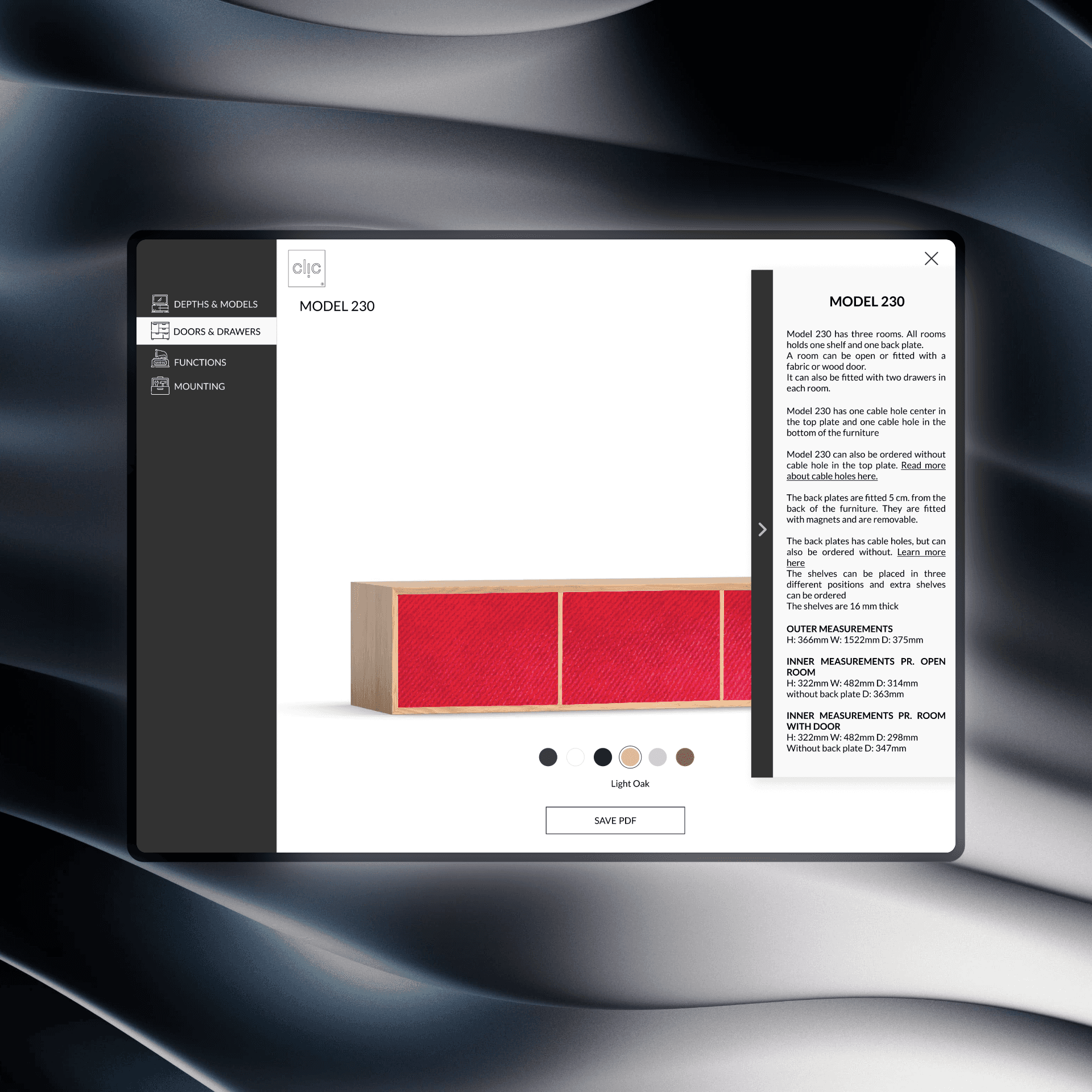
Configurator: Full-screen menu—select depth & model, pick finishes, add functional modules (vinyl hole, cable trays, etc.)
5. Design & Prototype
Low-Fidelity Wireframes → High-Fidelity Mock-ups using Clic’s existing assets
Scan Cards: QR-code guides on showroom tablets
Interactive Prototype: Desktop-optimized web app, tablet-friendly layout
6. Testing & Iteration
6.1 Concept Validation (Think-Aloud)
Participants: 6 users (mixed ages 27–42)
Findings:
Hero video drew interest but needed clearer CTAs
Slider steps helpful, but wording required tightening
Early configurator menus were confusing—depth labels and back navigation missing
6.2 Heuristic Evaluation
Evaluators: 8 UX peers applying Nielsen’s heuristics
Actions: Task flows on models page; feature slider; full configurator
Outcomes:
Improved visibility of scroll-down arrow and “Customize” button
Added clear “Back” exit and progress indicators in menu
Enhanced contrast and reduced side-panel text bulk
6.3 Prototype Testing & Sprint Retrospective
Second Think-Aloud with dealers and end users
Metrics:
Ease of Use: average 4.3/5
Usefulness: average 4.5/5
Aesthetic Appeal: average 4.4/5
Feedback:
Desire for 3D rotation or zoom-ins on functions
Request to display pricing summary in-configurator
Suggest in-page video captions for accessibility
7. Outcome & Impact
70% Functional Prototype delivered after Sprint 1
Learning Loop & Refinements in Sprint 2, culminating in final usability tests
Stakeholder Benefits:
Standardized digital sales tool for dealers
Engaging online experience replacing static catalog
Foundation for future AR, pricing integration, and e-commerce
8. Lessons Learned & Next Steps
Lessons:
Balance visual richness with navigational clarity
Embed progressive disclosure to avoid overwhelming users
Next Steps:
3D Configuration: integrate WebGL-based rotations
Pricing Module: real-time cost preview per config
E-Commerce Integration: enable end-to-end online purchase